If you’ve found yourself reading this article, you’re probably looking for ways to increase your conversions.
A/B testing is one of the best ways to do this, but, where do you begin?
Without being dramatic, there is basically an infinite number of things you can A/B test. From design changes to button styles, pop-ups and content, the possibilities are endless.
As a CRO web design agency, we know a thing or two about A/B testing. In this article, we’re going to give you some key ideas for A/B testing, so you can steer clear of stabbing in the dark.
What is A/B testing?
Put simply, A/B testing is a user experience research method.
Usually, there will be two variants, A and B. The test will run, then after a period of time, you’ll know which variant has come out on top.
Why is A/B testing important?
You know that saying “Insanity is doing the same thing over and over again and expecting different results”? Well, that applies to marketing too.
If something isn’t working, you need to find a way to change it. A/B testing is that way.
With A/B testing you tweak and fine-tune small things, one at a time. After a trial period, you can then decide which version is better (A or B). Then, you’re making informed improvements. Instead of random guesses.
Where can you A/B test?
You can A/B test pretty much anything and everything.
Try Hellman’s mayo in your sandwich one day and Heinz the next — but don’t change anything else. Which sandwich was better? That’s an A/B test.
But anyway, we’re a marketing agency. Not a sandwich shop. So we’re going to talk about marketing A/B tests.
Now, again, you can A/B test pretty much anything and everything. But two of the most common things are landing pages and email marketing campaigns. We’re going to look at each of those in more detail…
Landing pages
A/B testing your landing pages can help:
- Reduce bounce rates
- Increase click-through rates
- Up conversions
Here are some landing page A/B testing ideas to get you started.
CTA buttons
CTA buttons are super important, so you need to get them right.
To test CTA buttons you can change the button color, change the button text or change the button position.
Button colors
Looking at button color in more detail, one of the biggest mistakes designers make is too little contrast between a CTA button and the background. According to WCAG guidelines, a contrast ratio of at least 3:1 is required for graphics elements like buttons.
Even better, if you can make buttons a color that’s not elsewhere on the page, they’ll stand out even more.
Button text
Another common mistake is weak button text. The button should be clear and to the point, demonstrating the benefits of clicking it.
On our home page site, for example, we found that ‘Get a free demo’ performs way better than ‘Get in touch’. It communicates exactly what will happen if you click that button, plus, the use of the word ‘free‘ is always enticing.

Headlines
Headlines are another huge one. They’re pretty much the first impression someone gets when they land on your site (along with the hero image, but we’ll get to that later).
Like buttons, headlines should be concise and to the point.
Talking about ourselves again, after some headline A/B testing, we settled on ‘Websites that turn visitors into clients’.
That headline trumped:
- “CRO optimized websites” probably because most of our users don’t know what CRO is
- “Website’s that convert” a good second choice but ‘convert’ is a bit of a loose term
Why did it trump those two? Because it’s clear, to the point and it tells browsers exactly what they can expect from our websites. Clients.

Forms
Almost every website contains some kind of form. Gone are the days of a simple contact fields and a ‘submit’ button. Users expect a lot more now.
To make your form effective, you need to offer something in exchange for the data. People don’t want to give away their information for nothing. Going back to us, again, we offer a free demo.
Other things that can work include:
- Ebooks
- White papers
- Free guides
- Free webinar access
- Free demo/free trial
After some A/B testing, you can find out which of these works best for your brand.
Tip: try to balance the prize with the payment. Don’t give away everything for nothing. Instead, find the sweet spot between your need for data and your user’s demand for something in return.
You can also test the form itself, changing form fields, order and style to see which form gets the most fill-ins.
Above the fold
Above the fold is any part of the web page that is shown before someone scrolls. We’re going to do a web page anatomy lesson now, looking at this landing page from Intuit QuickBooks as an example.
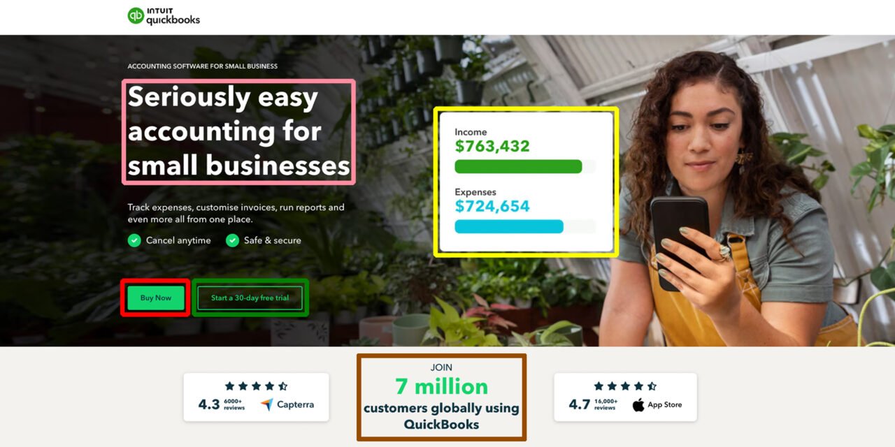
Pink rectangle: The headline. It’s short, to the point, and it shows the benefits Intuit QuickBooks offer, businesses can grow faster and work smarter.
Red rectangle: This primary CTA. The color is well contrasted from the background, and it explains what you’ll get if you click it.
Green rectangle: This is the secondary CTA, it’s design/color scheme is purposefully simpler, as this CTA is not as important. Further testing could be done here with submit button sizes, perhaps the ‘less important’ action button could be smaller? Or perhaps your site only needs a single CTA?
Yellow rectangle: This is the hero image, or in this case, a video. When A/B testing this is a key area to look at. You can experiment with static images, videos, product images, lifestyle shots or illustrations, to see what works best for you.
Brown rectangle: This is the guideline, it entices users to scroll down the page, letting them know what they can expect to see in the next section.
You can (and should!) test and experiment with every part of this section. By implementing small changes, one thing at a time, you can make data-driven decisions that help you meet your conversion goals.
Email marketing
A/B testing is also an essential part of your email marketing strategy.
Email campaigns are easy to A/B test, as so many email providers (like Omnisend and Mailchimp) facilitate split testing.
Tip: ‘Split testing’ is just another way to say A/B testing. It’s when you send two separate versions of an email to two segments of your mailing list, then, you measure the results.
Here are some testing ideas for your marketing emails, to get you started.
Email subject
This is the first part of the email that your audience will see. When done well, it will entice them to click into the email. When done badly… your email is probably going straight to the trash. Here are some ideas:
- Experiment with dynamic subject lines, using the recipients’s name. For example, ‘Sophia, your discount is waiting…’ vs ‘Your discount is waiting..’.
- Experiment with using questions versus statements. For example, ‘The sofa you’ve been waiting for…’ vs ‘Is this the sofa you’ve been waiting for?…’.
- Experiment with subject line length. For example, ‘It’s back…’ vs ‘The pumpkin spiced latte is back’.
Experiment with Emoji vs no Emoji. For example, ‘We’re waiting for you…’ vs ‘We’re waiting for you 😉…’.
Whilst you’re experimenting, just remember the KISS method. Keep it simple stupid. Don’t over complicate the email subject.
Email body
Email body A/B testing will help you understand how much content (or what kind of content) your contact list are willing to digest.
- Play around with image heavy vs copy heavy email bodies. Whilst you might think more images means more appealing, this might not be the case. A general rule is 60% copy and 40% image, but you can’t know your own magic ratio without some thorough split tests.
- Play around with copy lengths, too. It’s easy to get carried away telling potential customers all the amazing things about your brand. But, are they going to read all that? Maybe not. On the other hand, emails that are too short can confuse your target audience, especially if you miss out important information.
- Play around with interactive elements like videos and GIFs. Depending on whether they fit your brand, these can be great for user engagement. But, there’s only one way to find out…
Coupon codes
Offer messaging is a whole science, and one you should definitely be testing out.
Testing different coupon codes and phrasing will give you valuable insights to help you make better marketing decisions.
For example, whilst “50% off with this code” and “Buy one get one free with this code” are almost the same thing, you might find that one performs way better than the other.
Maximizing your testing efforts
Like we’ve said, you can A/B test pretty much anything. But to make sure your tests are effective and informative, we do have some guidelines for you to stick to.
Focus on a goal
Your A/B test should always be linked to, and based on, a clear business goal. For example, ‘increasing form fill ins’, ‘increasing email coupon use’, ‘reducing landing page bounce rates’. If you don’t have a business goal in mind, you’ll just be stabbing in the dark.
Small changes
To make informed decisions, you need to change and test small things at a time. We’re talking as simple as two landing pages that are virtually identical, apart from one CTA button being a different color from the other.
Testing times
Make sure you run tests for a statistically significant amount of time. If you average a conversion a day, you can’t expect to see significant impact within 48 hours. Run the test for a couple of weeks, to make sure you end up with enough data to conclude actionable insights.
Tweak and repeat
An A/B testing strategy is an ongoing process. So, keep on multivariate testing to refine your decisions based on any new insights.
Nail your marketing efforts
A/B testing can give you the insights you need to optimize your website, sales, conversions, contacts and email marketing campaigns. When done well, you can create a better user-experience, secure higher click-through-rates and increase engagement.
Just remember A/B testing is all about small variations. Whether you want to improve your customer experience or reduce cart abandonment rates, slow, steady and specific wins the race.