CLIENTS
Health insurance brokers CRO website redesign

Most health insurance websites look and feel the same.
Similar messaging. Similar layouts. Similar promises.
But when everything feels identical, users hesitate. And in a space built on trust, hesitation means lost enquiries.
That was the challenge with Health Insurance Brokers.
They offer tailored private cover for individuals, families and businesses across the UK, but their website wasn’t clearly communicating that value or guiding users confidently towards getting a quote.
So we redesigned the experience with one goal: make it easier for users to understand their options and take action.
The challenge
The existing website had a few common issues we see across insurance providers:
Messaging that blended in with competitors
A lack of clear structure on the homepage
Too much friction before reaching a quote
Not enough trust signals early in the journey
For users trying to compare private health insurance, this creates uncertainty. And uncertainty leads to drop-off. This is something we fix across many of our projects, including recent work like our NYCE Funding website redesign and N2ITIV project.
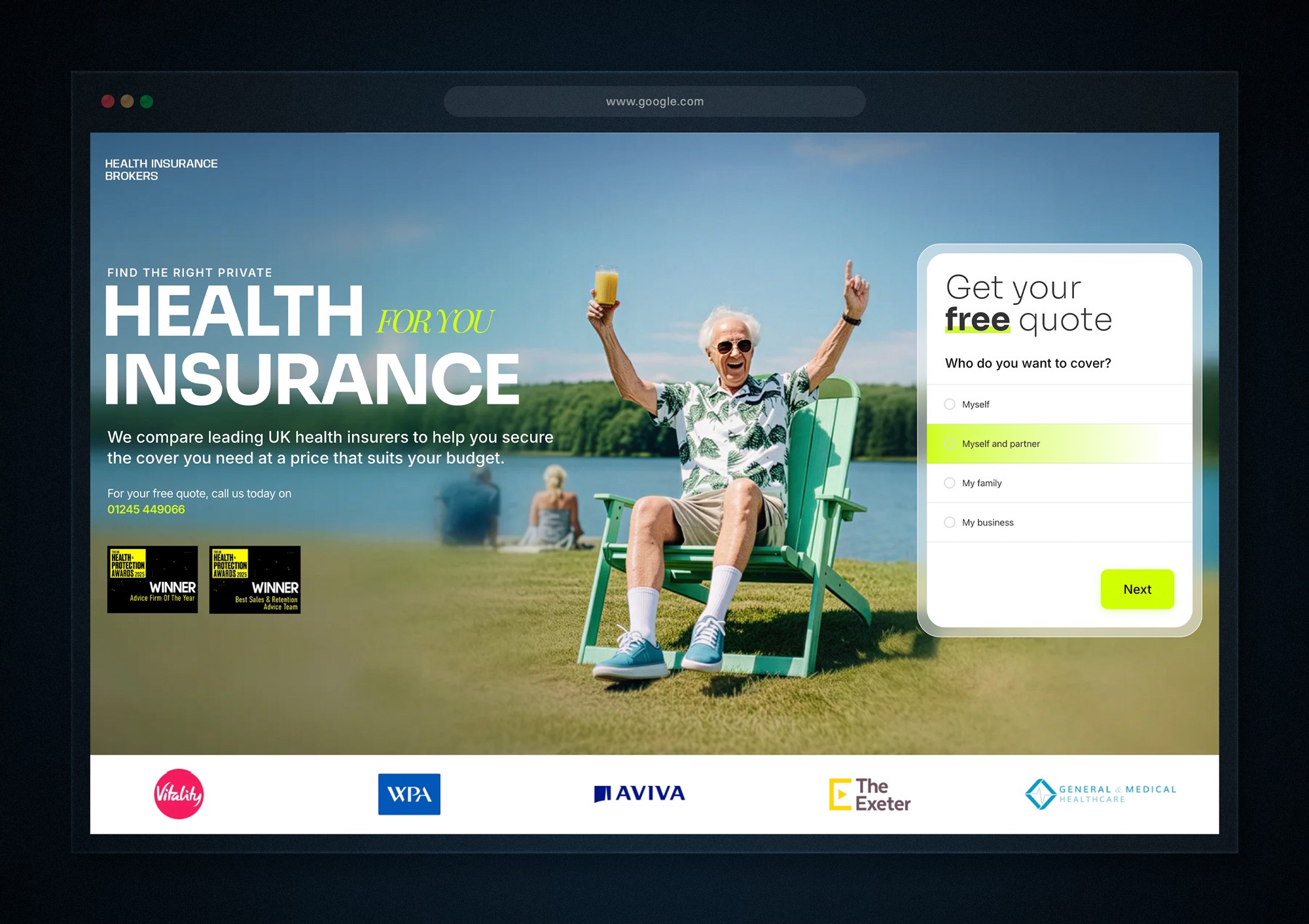
After the redesign: Clear structure and focused messaging made it easy for users to understand their options and take the next step.
Our approach
We didn’t just redesign the visuals.
We reworked how the website communicates, guides, and converts.
The focus was simple:
Help users quickly understand who it’s for, what’s on offer, and how to get a quote without confusion.
1. Clear, user-focused messaging
We replaced generic, industry-heavy language with clear, direct messaging.
The homepage now quickly answers:
Who the service is for
What types of cover are available
Why users should trust them
This reduces cognitive load and helps users feel more confident from the first few seconds.
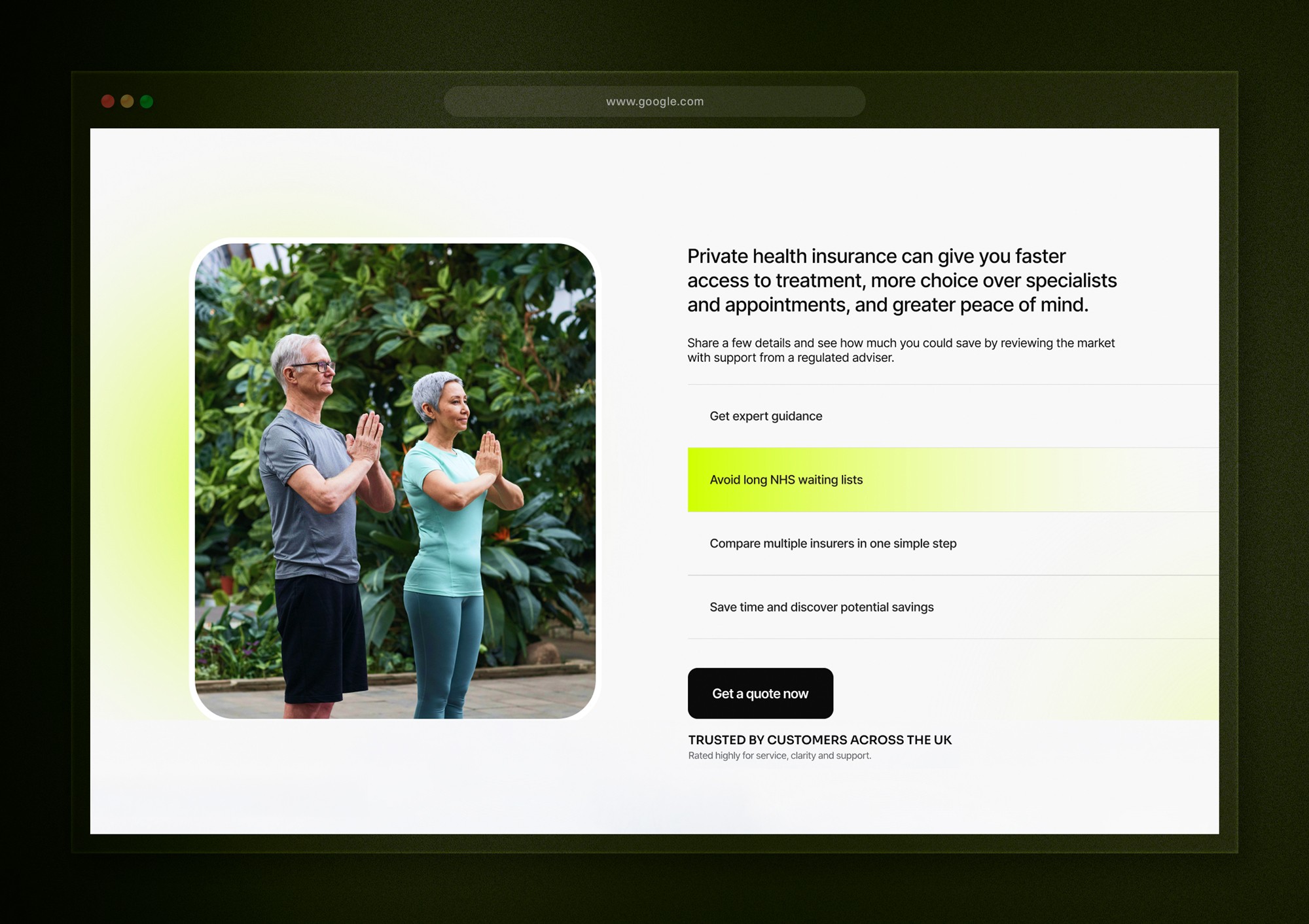
2. A more intentional homepage flow
Instead of jumping straight into company-focused content, we structured the page around the user journey:
Who it’s for
What’s available
Why choose them
How it works
Call to action
This creates a natural progression and makes it easier for users to move towards requesting a quote.
The redesigned homepage introduces a clearer flow, helping users quickly understand who it’s for and how to get a quote.
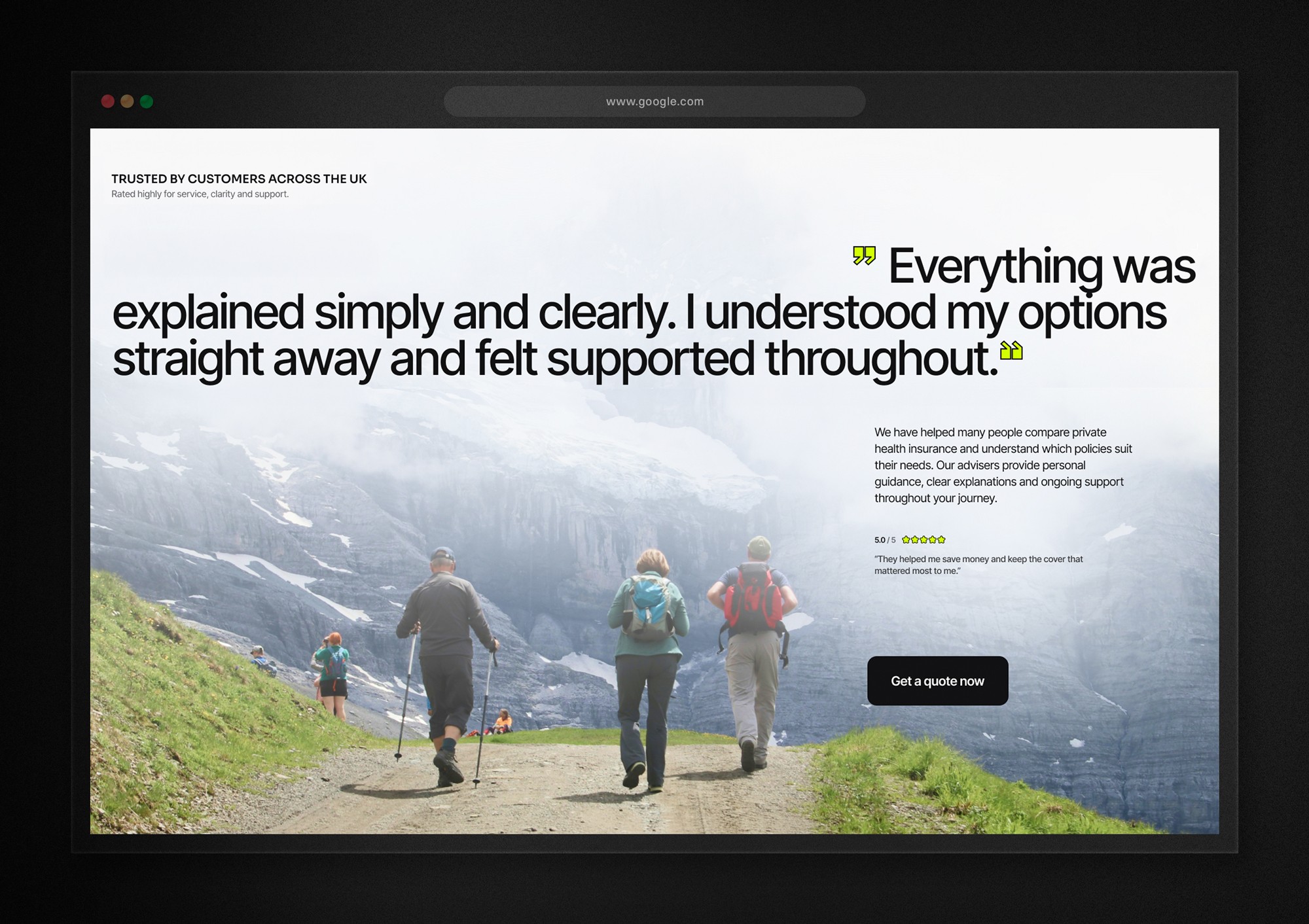
3. Stronger trust signals throughout
In health insurance, trust is everything.
We introduced clearer trust elements across the page, including:
Defined customer groups (so users can quickly see where they fit)
Key benefits and promises
Simple, reassuring microcopy around the enquiry process
These small additions help remove doubt at key decision points.
Trust elements are introduced early to reduce hesitation and build confidence before users request a quote.
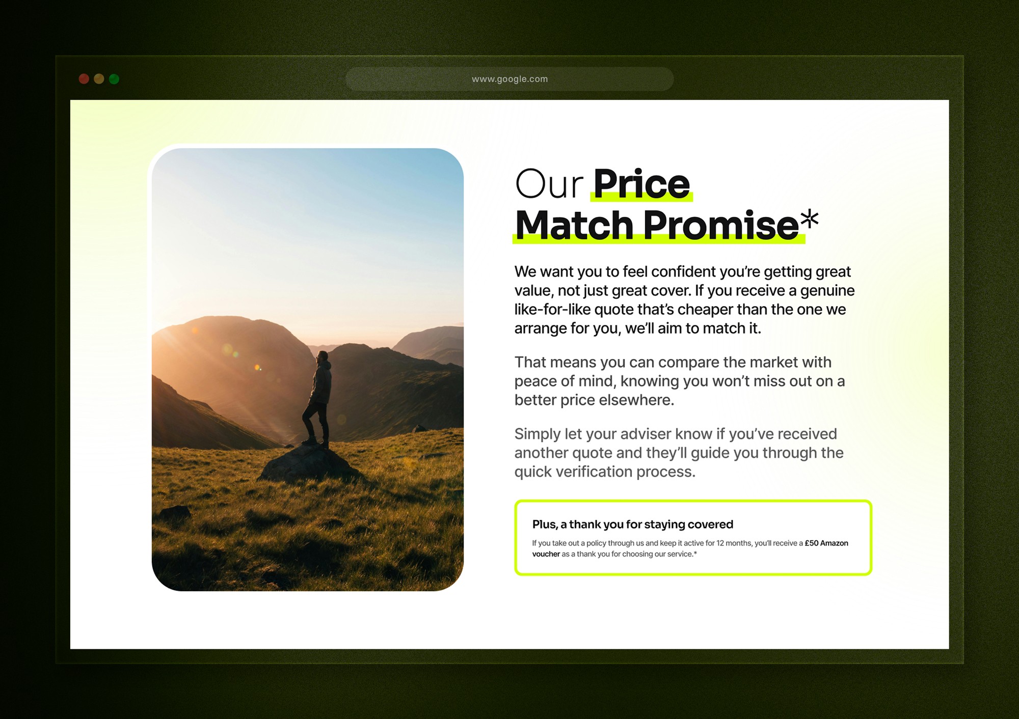
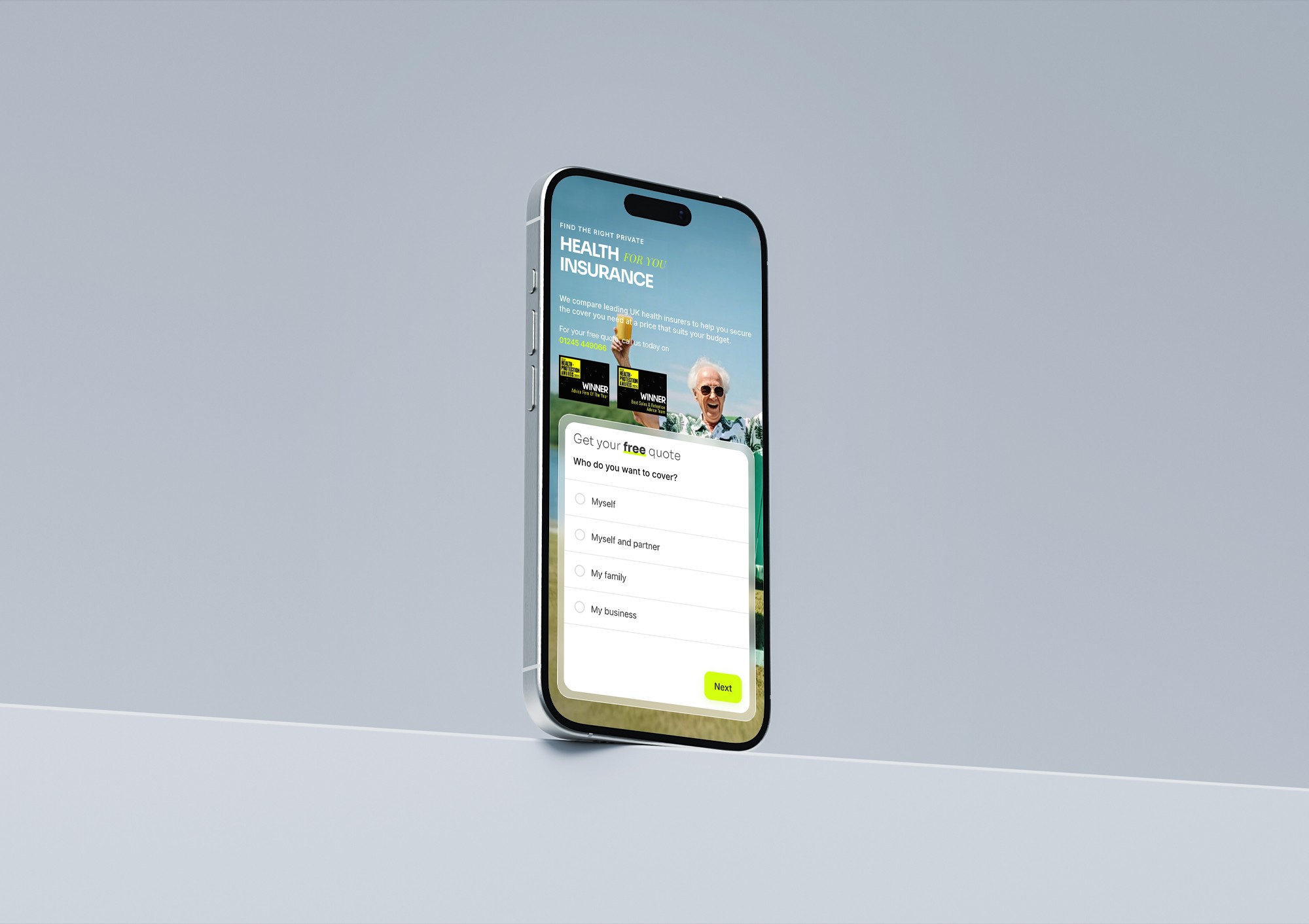
4. Reduced friction in the quote journey
We simplified how users move through the site.
Clear calls to action are placed throughout, allowing users to request a quote as soon as they feel ready, rather than forcing them through unnecessary steps.
The result is a smoother, more intuitive experience.
5. Built for clarity and scalability
Behind the scenes, the site is structured to be easy to manage and expand.
This allows the team to:
Update content quickly
Refine messaging over time
Add new pages or services without disrupting the core journey
A simplified quote journey allows users to take action as soon as they feel ready.
The result: A clearer, higher-converting health insurance website
The new Health Insurance Brokers website is clearer, more structured, and far more aligned with how users actually make decisions.
Instead of overwhelming visitors, it guides them.
Instead of blending in, it builds trust.
And most importantly, it makes it easier for users to request a quote with confidence.
The final result is a clearer, more structured experience designed to guide users and increase enquiries.
Thinking about your own website?
If your website is getting traffic but not generating enough enquiries, the issue is rarely traffic.
It’s usually clarity, structure, or friction.
We offer free homepage redesigns to show exactly how your site could convert more visitors into customers.


